🎯 6) Pseudo-Classes — Links
מה זה Pseudo-classes ללינקים?
סלקטורים שמתארים מצב של הקישור: האם ביקרנו בו, האם העכבר מעליו, האם הוא לחוץ או קיבל פוקוס. השימושיים ביותר:
:link— קישור שלא ביקרנו בו עדיין.:visited— קישור שביקרנו בו (מוגבלות אבטחה: רוב ה־CSS חסום).:hover— כשהסמן מעל הקישור.:active— בזמן לחיצה.:focus/:focus-visible— קיבל פוקוס (בעיקר במקלדת).:any-link— תופס גם:linkוגם:visited.
/* הסדר המומלץ (LV(H)FA): */
a:link    { color: #38bdf8; }   /* L */
a:visited { color: #a78bfa; }   /* V */
a:hover   { color: #22d3ee; }   /* H */
a:focus   { outline: 2px solid #f59e0b; outline-offset: 2px; } /* F */
a:active  { color: #06b6d4; }   /* A */
דמו: רשימת קישורים במצבים שונים
נסו לעבור עם העכבר, ללחוץ, או לנווט עם המקלדת (Tab/Shift+Tab, Enter).
* אם כבר ביקרתם באחד הקישורים, הוא יקבל עיצוב :visited (תלוי היסטוריית דפדפן).
קישור כמו כפתור
שמרו על פוקוס נראה וניגודיות טובה כדי לשמור על נגישות.
נגישות: :focus-visible
:focus-visible מציג מסגרת פוקוס בעיקר בניווט מקלדת — ונמנע כשמשתמשים בעכבר.
a:focus { outline: none; }            /* מסירים ברירת מחדל */
a:focus-visible {
  outline: 3px solid #f59e0b;          /* מוצג בניווט מקלדת */
  outline-offset: 3px;
}
בחירת ילדים מאלמנט (ילדים אלו ערכים שיש בתוך אלמנט)
שימוש ב־:first-child, :last-child, :nth-child() כדי לעצב פריטים לפי המיקום שלהם כהילדים של אלמנט האב.
- פריט 1
- פריט 2
- פריט 3
ul.demo-children { font-size: 40px; list-style: none; }
ul.demo-children li:first-child { color: hotpink; }
ul.demo-children li:last-child { color: indigo; }
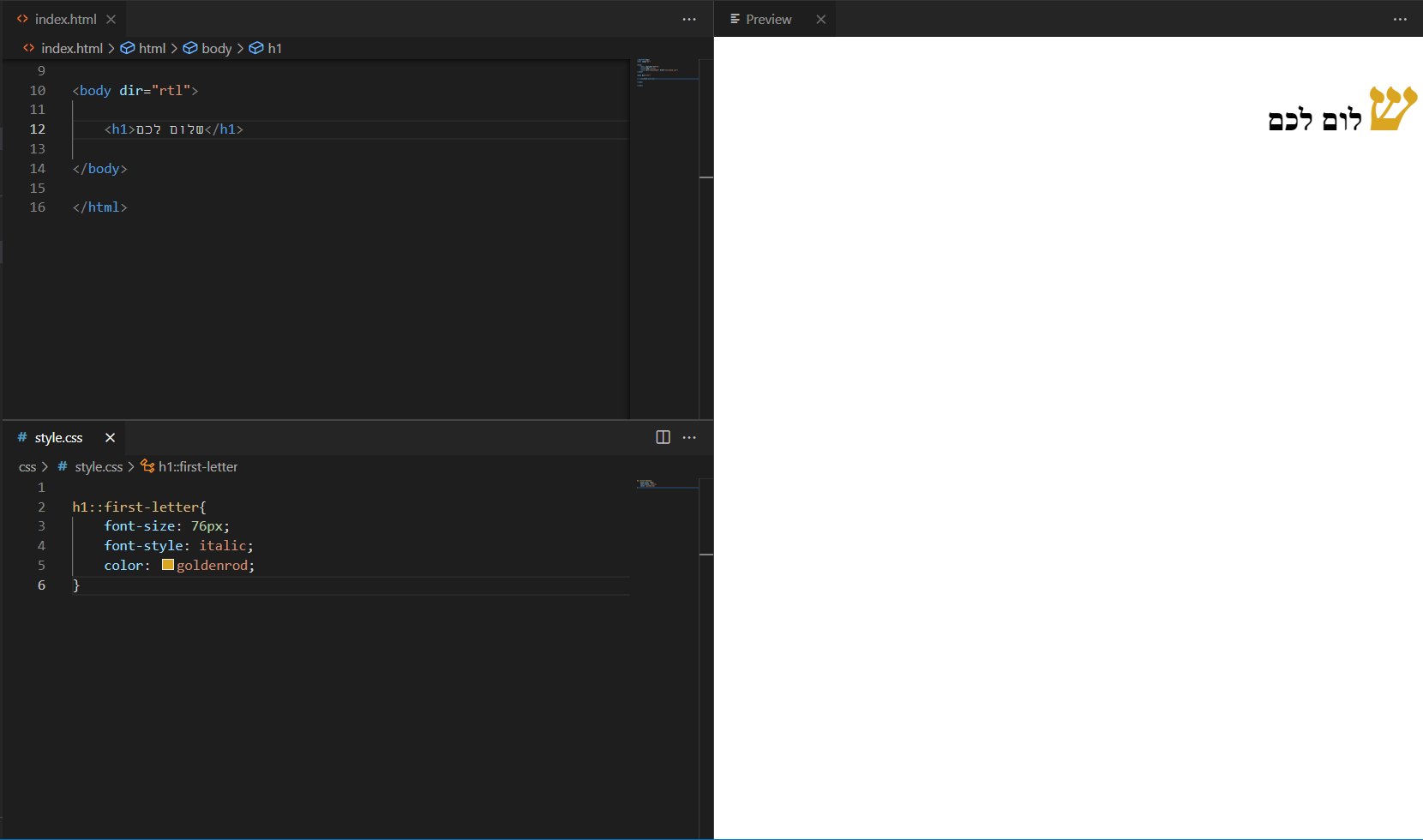
ul.demo-children li:nth-child(2){ color: lightskyblue; }בחירת אותיות:
שימוש ב־::first-letter כדי לעצב את האות הראשונה בפיסקה.
שלום לכולם
.first-letter-demo::first-letter{
  font-size: 76px;
  font-style: italic;
  color: goldenrod;
}
Pseudo-class-forms
דוגמאות ל־:focus, :checked, :valid, :invalid, :disabled.
/* דוגמת טופס */
.demo-form .inp:focus { outline: none; box-shadow: 0 0 0 10px rgba(0,0,0,.08); }
.demo-form .chk:checked + label { color: yellow; background: rgb(0,217,255); }
.demo-form .inp:valid   { border: 3px solid #00ff00; }
.demo-form .inp:invalid { border: 3px solid #ff0000; }
.demo-form .btn:disabled{ color: #ff0000; }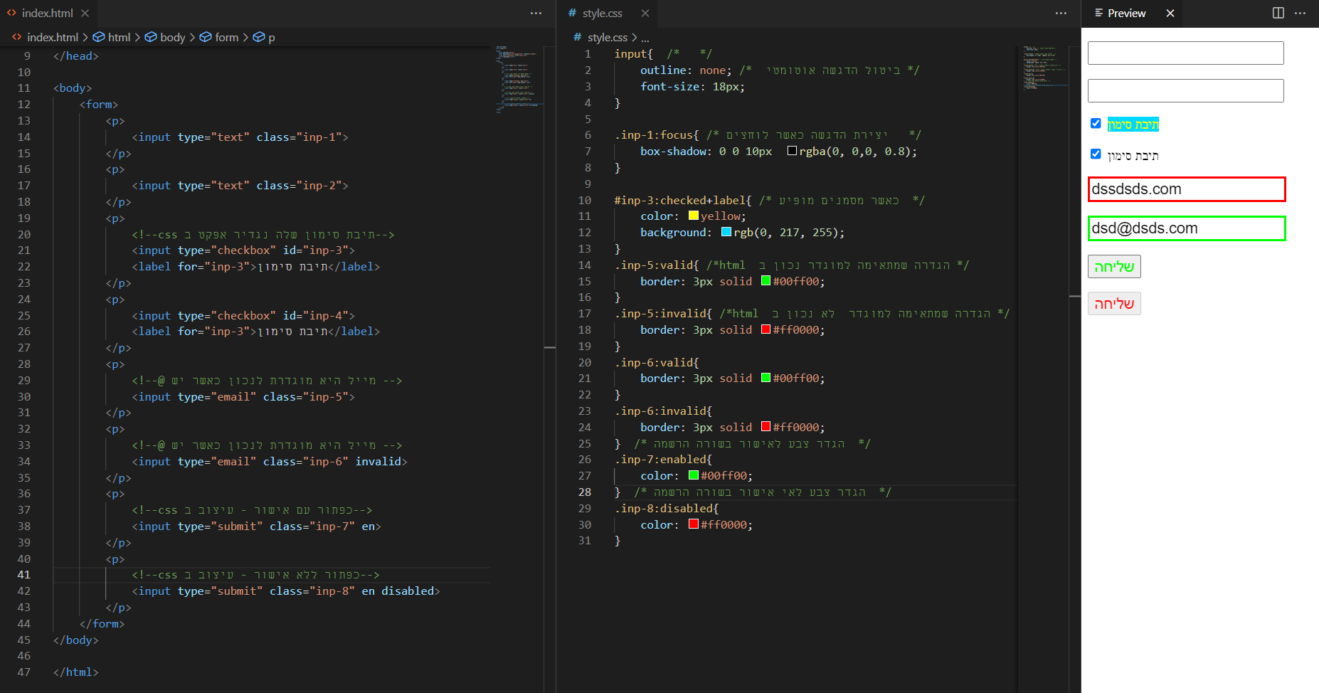
Pseudo-class-position
שימוש ב־:first-of-type, :last-of-type, :nth-of-type() כדי לעצב לפי מיקום מסוג האלמנט.
- שורה a
- שורה b
- שורה c
- שורה d
ul.demo-type { list-style: disc; }
ul.demo-type li:first-of-type { color: #10b981; }
ul.demo-type li:last-of-type  { color: #ef4444; }
ul.demo-type li:nth-of-type(even) { font-weight: 700; }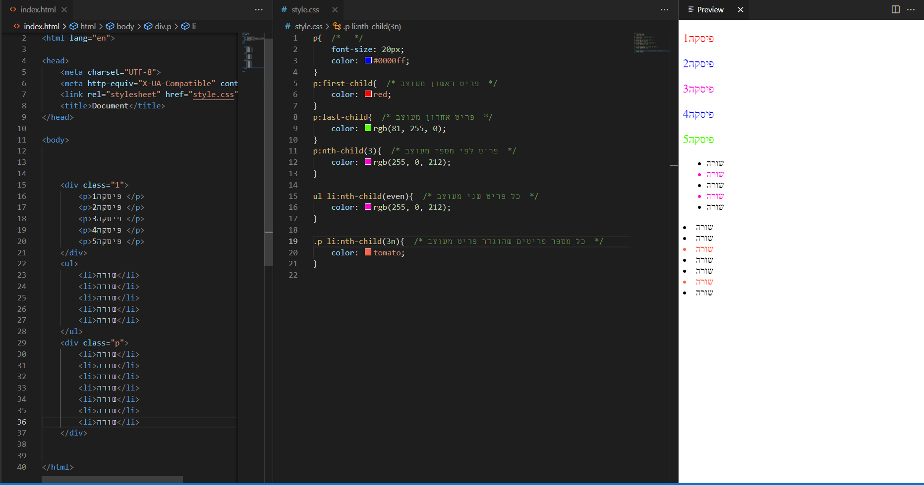
Pseudo-class:elements
בעצם אלו Pseudo-elements — למשל ::before / ::after להוספת תוכן דקורטיבי.
פסקה לדוגמה 1
פסקה לדוגמה 2
.pelem p::before { content: "start "; color: violet; }
.pelem p::after  { content: ""; border-top: 5px solid #ccc; display: block; }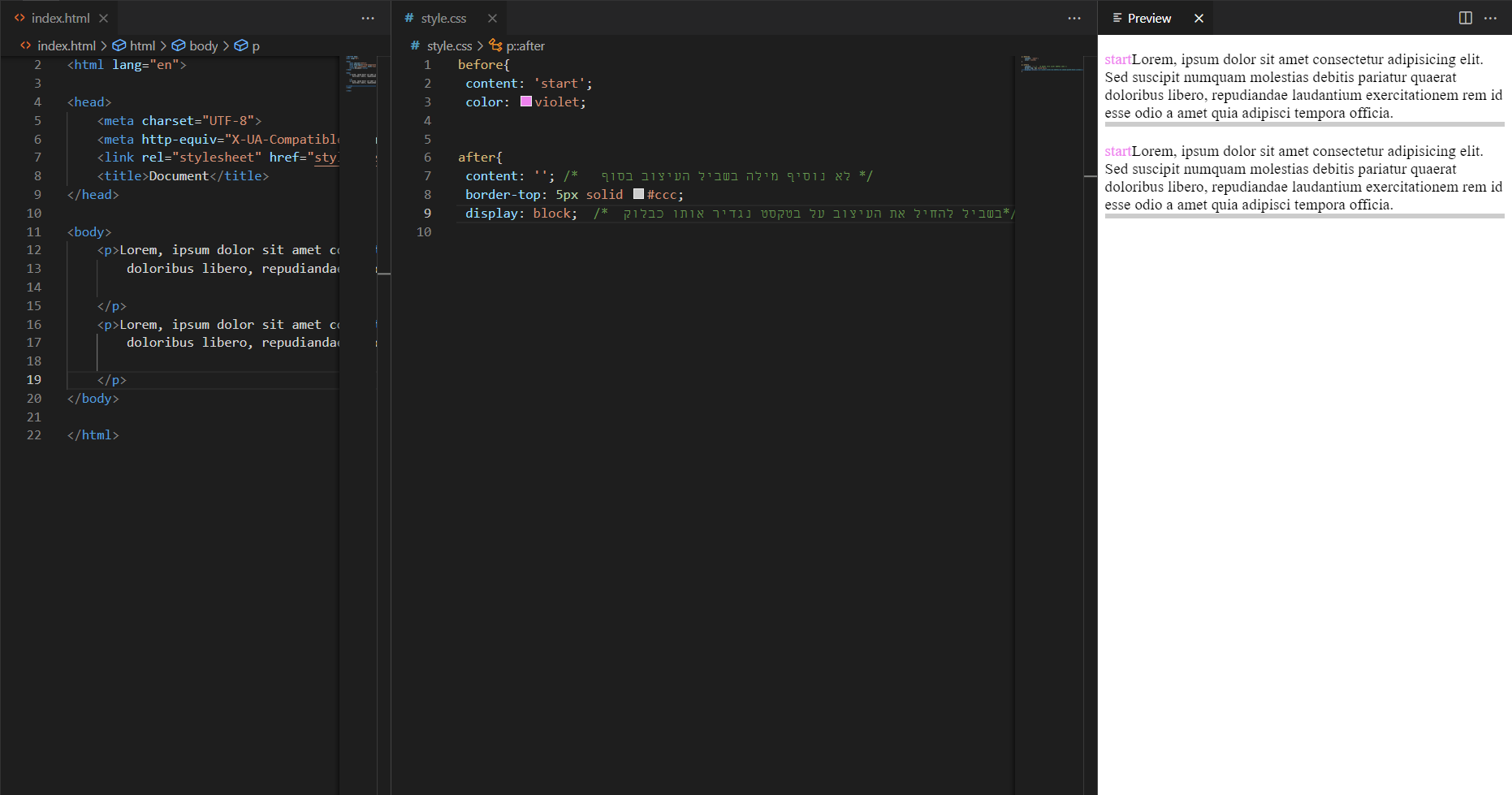
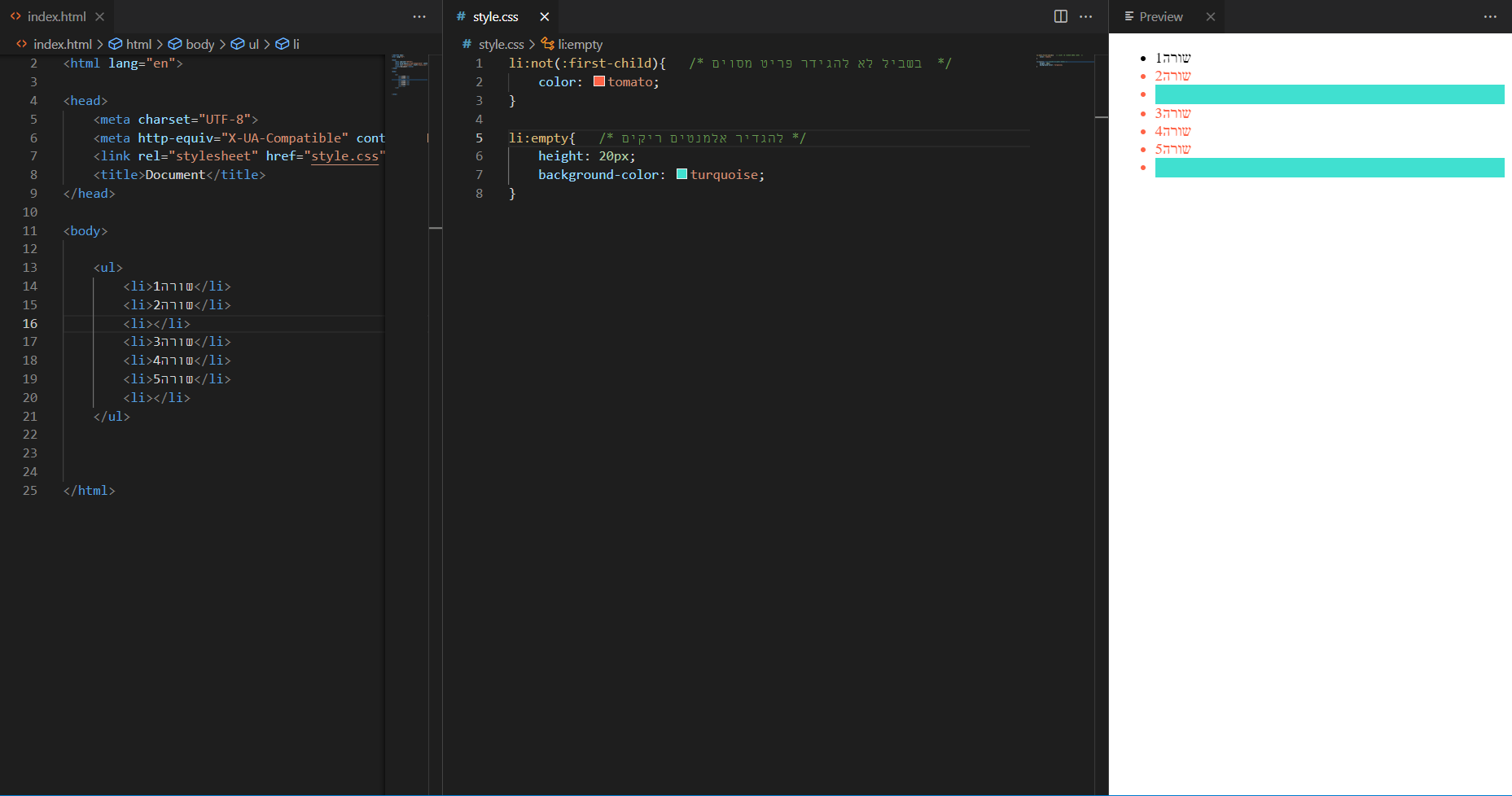
Pseudo-class:other
דוגמאות ל־:not() ו־:empty.
- שורה 1
- שורה 3
- שורה 4
.demo-other li:not(:first-child) { color: tomato; }   /* כל מה שאינו הראשון */
.demo-other li:empty { height: 20px; background: turquoise; } /* אלמנט ללא תוכן */