📐 8–15) Position / Z-Index / Overflow / Display
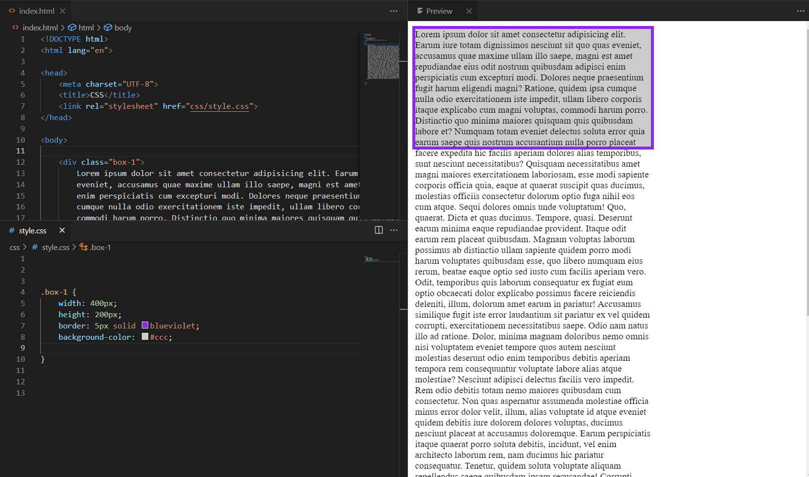
8) Position: relative
ממצב relative האלמנט נשאר בזרימת המסמך, אבל אפשר להזיז אותו בעזרת top/right/bottom/left ביחס למקומו המקורי.
/* HTML */
<div class="rel-box">
  <div class="rel-child">אני זזתי 16px ימינה ולמטה</div>
</div>

/* CSS */
.rel-box   { position: relative; border: 2px dashed #22d3ee; padding: 24px; }
.rel-child { position: relative; right: -16px; top: 16px; background:#e0f2fe; padding:.5rem 1rem; }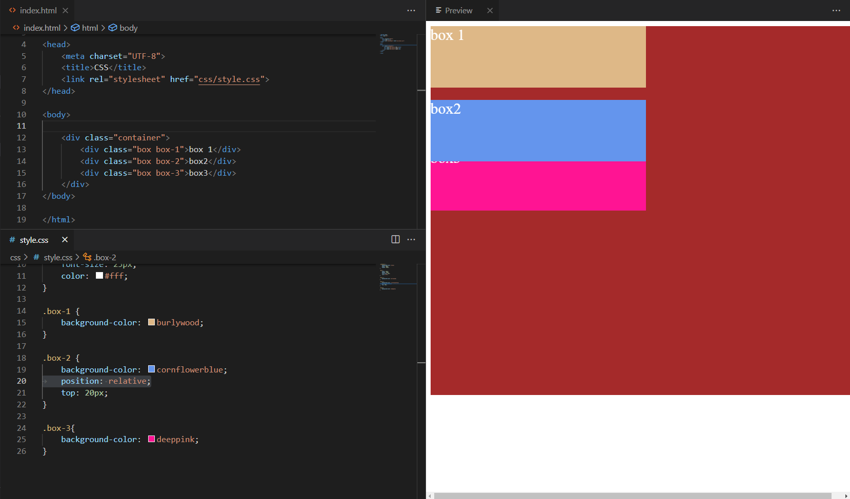
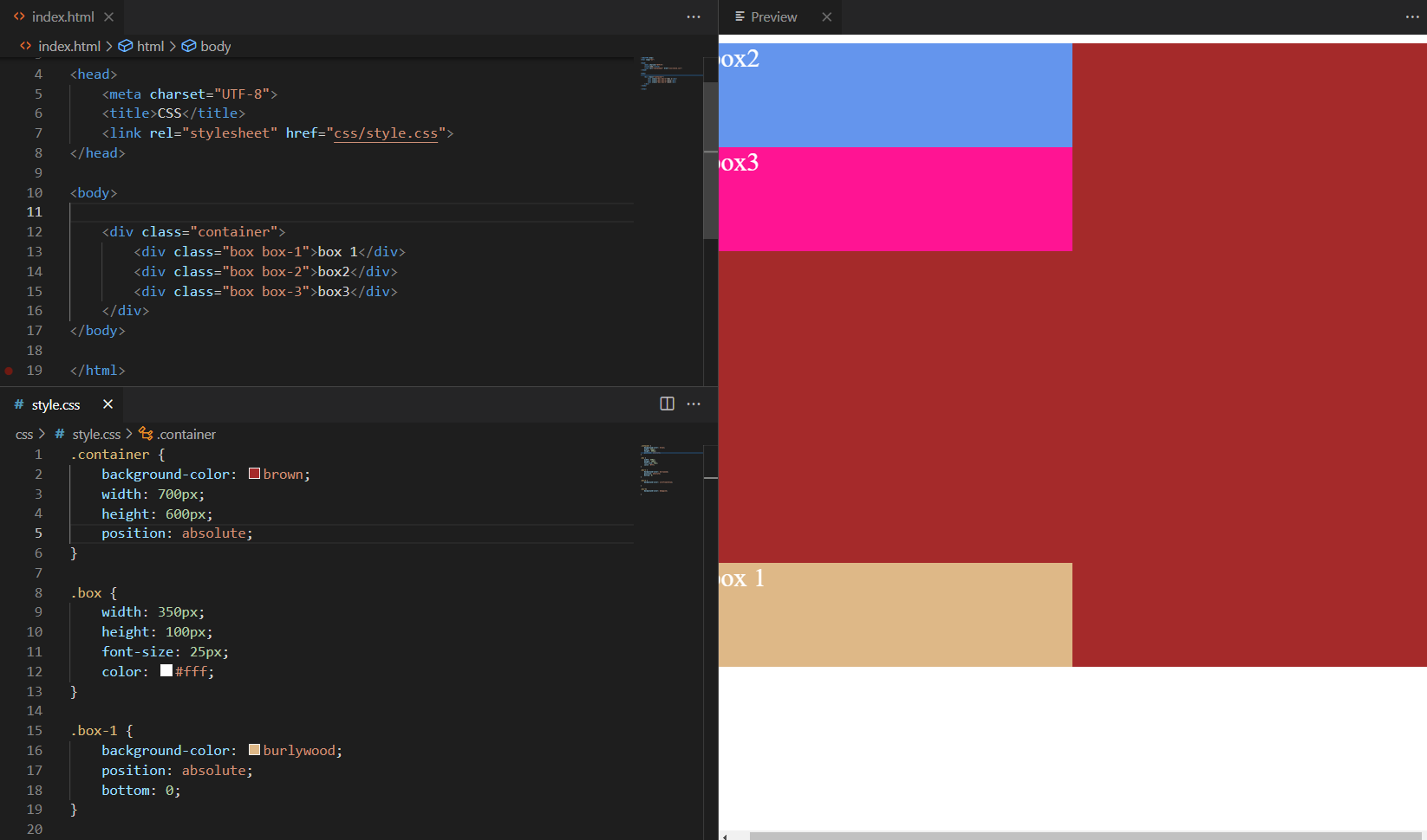
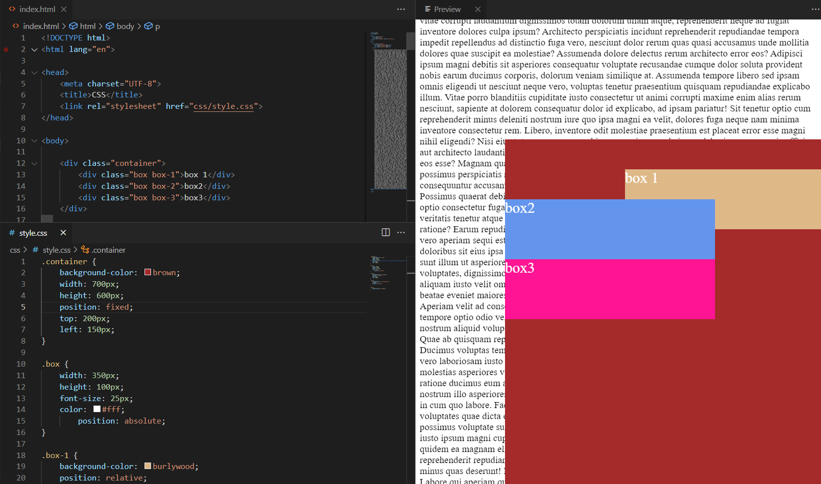
9) Position: absolute
absolute מוציא את האלמנט מהזרימה וממקם אותו ביחס לאב הכי קרוב שממוצה (position שונה מ־static). אם לא קיים—היחוס הוא למסמך.
/* ללא אב ממוצה: היחס לחלון/מסמך */
.abs-alone { position:absolute; top:24px; left:24px; }

/* כאשר נגדיר בהורה יחס (relative) */
.abs-parent { position:relative; height:160px; border:1px dashed #a78bfa; }
.abs-child  { position:absolute; bottom:12px; left:12px; }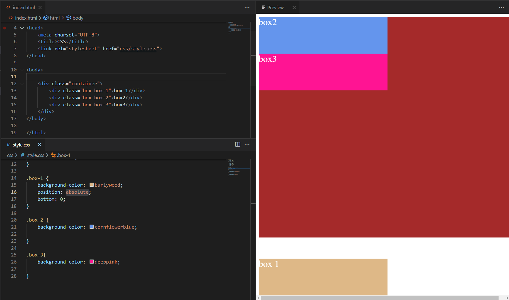
10) z-index
קובע סדר שכבות על ציר Z. ערך גבוה יותר יופיע מעל. יוצרי stacking context (למשל position + z-index, או opacity<1, transform וכו’) משפיעים על האופן שבו שכבות נערמות.
.z-demo { position:relative; height:160px; }
.box     { position:absolute; width:120px; height:120px; }
.box-1   { background:#fca5a5; top:20px; left:20px; z-index:0; }
.box-2   { background:#fdba74; top:40px; left:60px; z-index:1; } /* מעל */
.box-3   { background:#bef264; top:60px; left:100px; z-index:0; }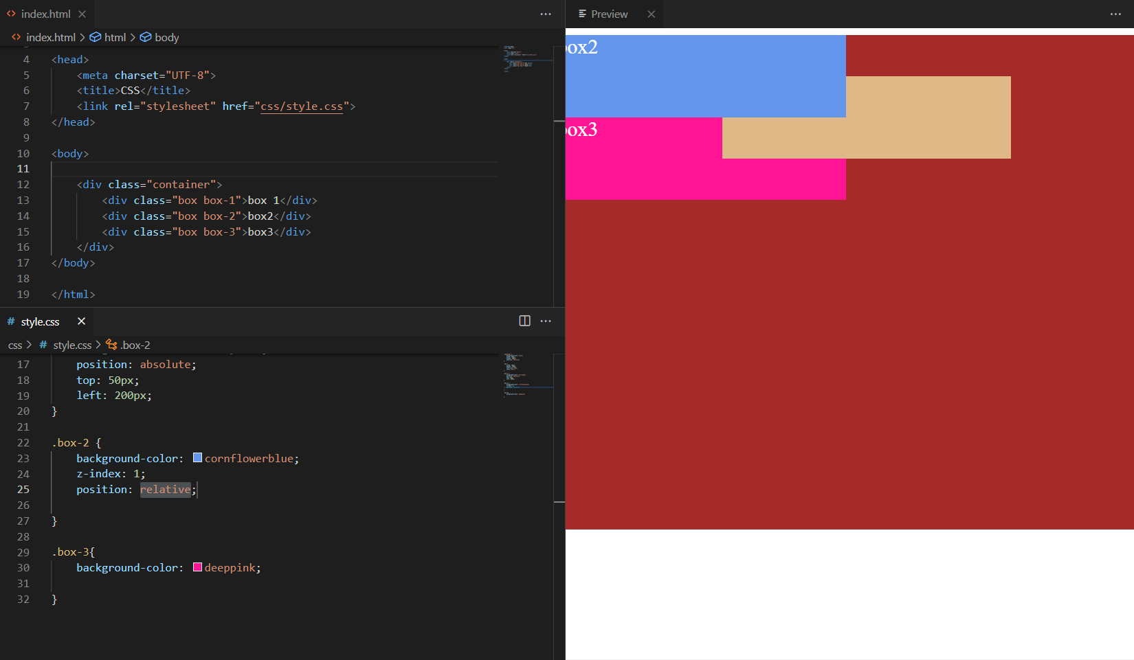
11) Position: fixed
מקבע אלמנט יחסית לחלון הדפדפן. נשאר גלוי גם בגלילה (טיפים, כפתור “Back to top”, סרגלים).
.fixed-banner {
  position: fixed; top: 12px; inset-inline-end: 12px;
  background:#0ea5e9; color:#fff; padding:.5rem .75rem; border-radius:.5rem;
}
12) Position: sticky
אלמנט זורם כרגיל עד שמגיע לסף (למשל top: 0), ואז “נדבק” לשוליים בזמן גלילה בתוך הקונטיינר שלו.
.sticky-header { position: sticky; top: 0; background:#fff; z-index:10; }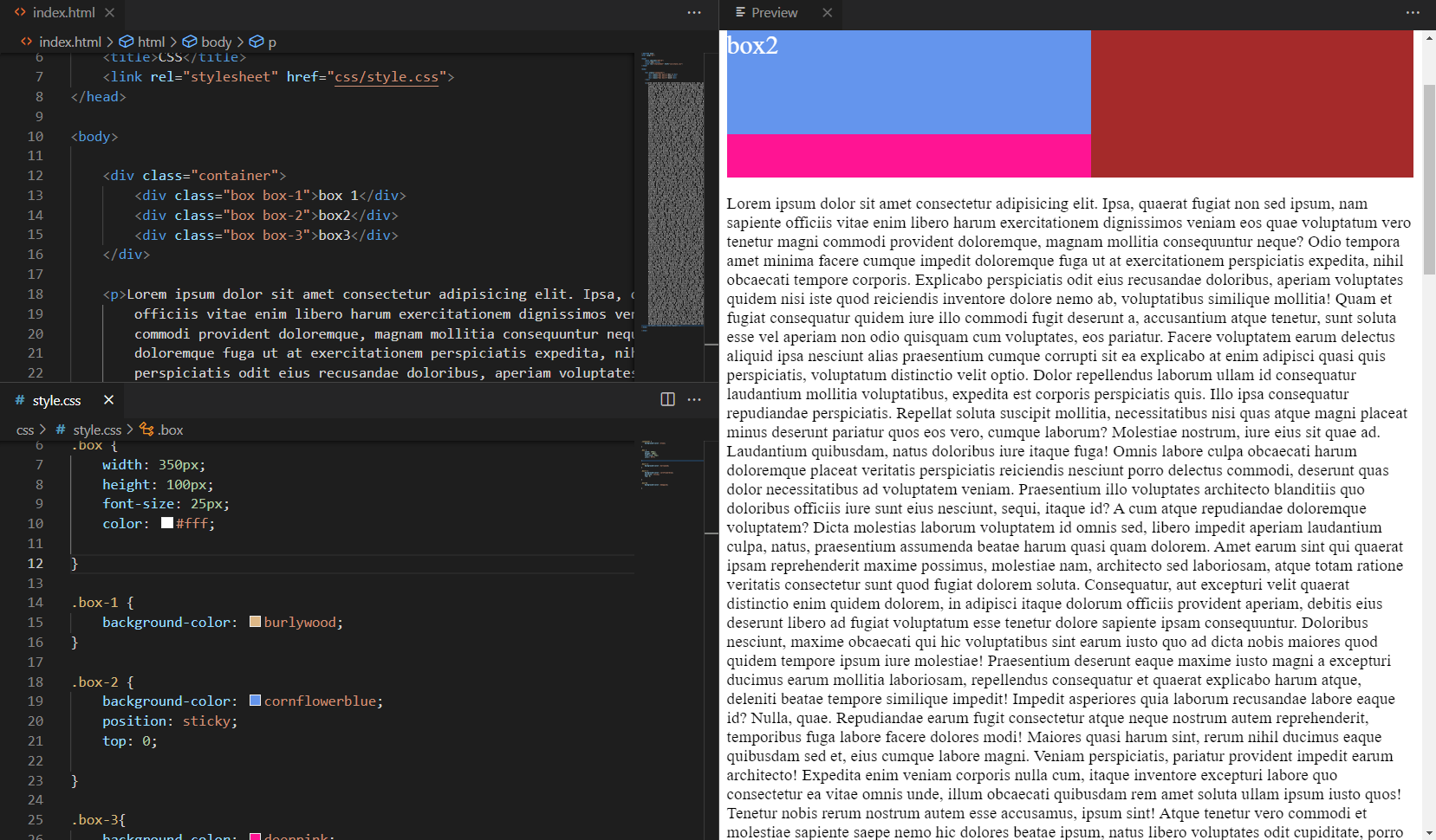
13) Overflow
שולט בתוכן שחורג ממידות הקופסה: visible (ברירת מחדל),hidden, scroll, auto, clip. אפשר גם overflow-x/overflow-y.
.overflow-box {
  width: 260px; height: 110px; border:1px solid #cbd5e1; padding:8px;
  overflow: auto;        /* נסו להחליף ל-hidden / scroll / clip */
}
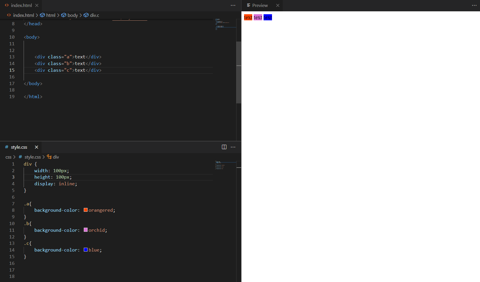
14) Display: inline
אלמנטים מופיעים בשורה אחת לפי התוכן. לא ניתן לקבוע להם width/height, ושוליים אנכיים כמעט לא משפיעים.
.inline-demo span {
  display:inline; background:#e9d5ff; padding:.25rem .5rem; margin-inline:.25rem;
}
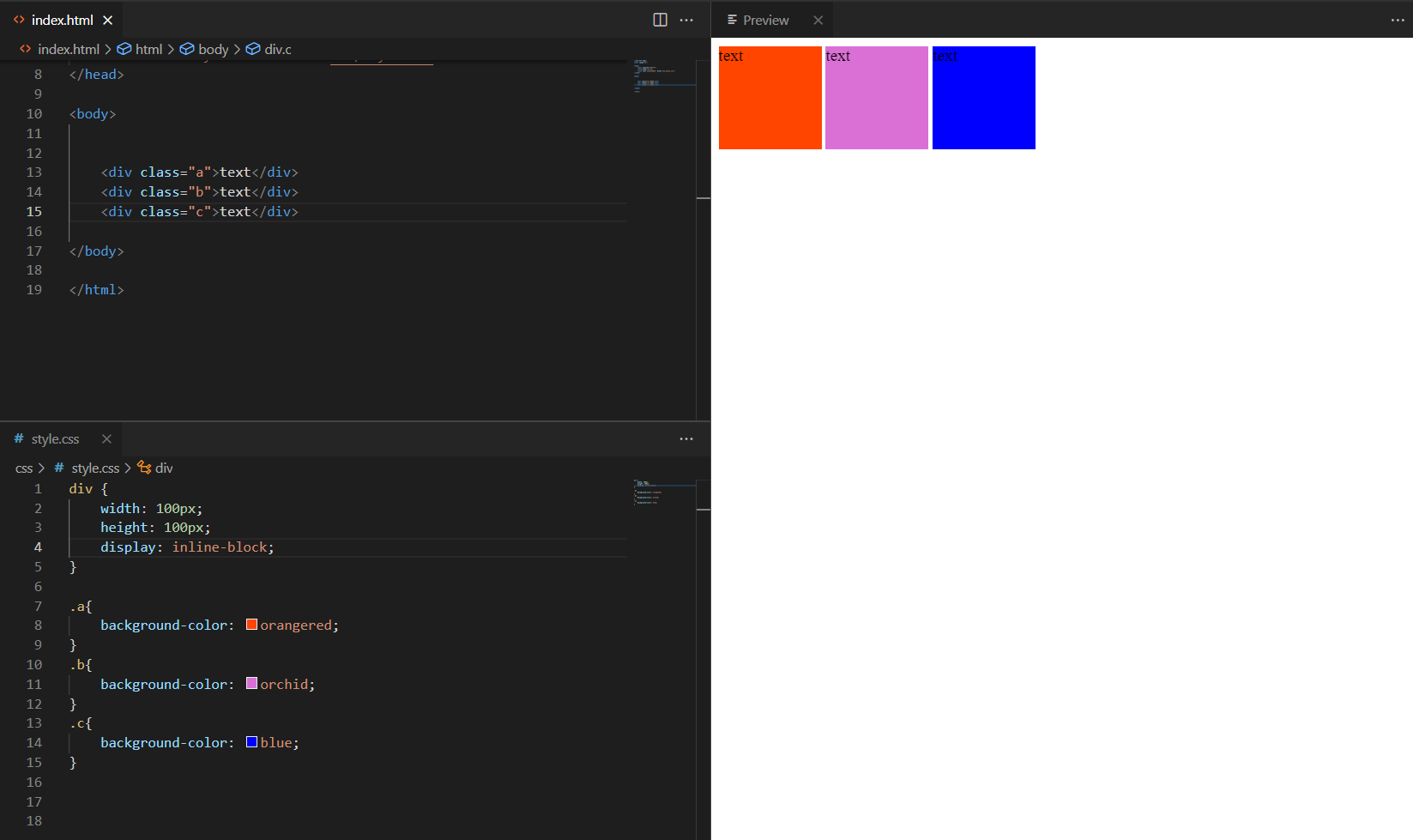
15) Display: inline-block
כמו inline אך ניתן לקבוע רוחב/גובה/מרווחים. מתאים לכפתורים, תגיות, כרטיסים קטנים.
.inline-block-demo .chip{
  display:inline-block; min-width:8ch; padding:.35rem .6rem; margin:.25rem;
  border-radius:999px; background:#06b6d4; color:#fff; text-align:center;
}